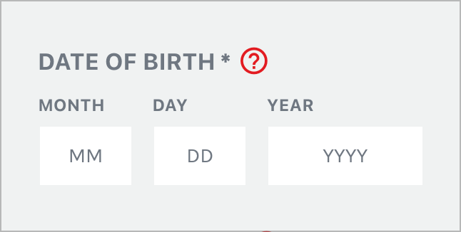
A client of mine recently asked if I could customize the birthdate field on their form.
The default Gravity Forms date picker field was causing confusion as users have to click inside the field to see the date picker.
For example, if your birthday was on October 27th, 1978 you would have to click into the field to see the date picker drop down, select your birth year, and then select the day! A lot of errors can happen especially on mobile and not intuitive.
Instead of this date picker drop down field I decided to display 3 separate single-line text fields:
- Month
- Date
- Year
I then added CSS to make all 3 fields in a single line.

I had to map the form to Zoho but I was able to do this with using Gravity Forms merge tags.
FYI I got this trick from a post on UX Movement and then applied this strategy to my Gravity Forms form.