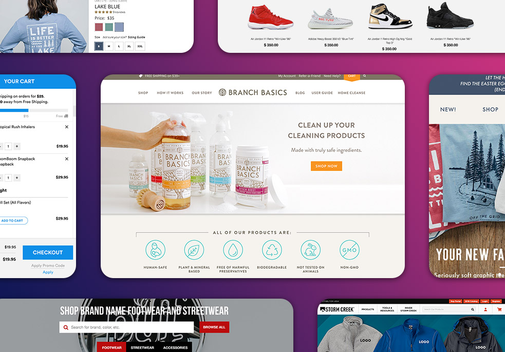
In this post I’m going to show you 6 Sexy Apparel Product pages to inspire your own ecommerce store.
I probably don’t need to tell you that a stellar product page helps your customers better understand your products, boost your brand, and give you a competitive edge, all of which lead to the main goal of ecommerce websites: SALES!
In fact, I used inspiration of these product pages to help boost my client’s sales by 24% within the first 6 months.
If any of those challenges sound familiar to you, I’ve got great news: I’m going to show you some of my favorites, and walk through what makes them so great in the hopes that you can apply these to your next product page design. Let’s dive right in.
Best Apparel Product Pages
1. Marine Layer
Tip #1: Feature Image Displaying Your Killer Product
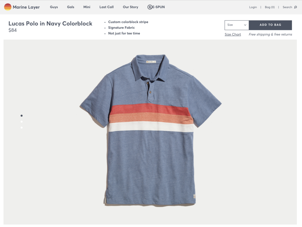
I confess that part of my reason for including this product page is because I have a big, fat crush on this product. It’s so intensely beautiful. What really stands out here is the relatively simple & plain design supplemented with awesome product photography. It gives you a sense of what it would be like to own this product yourself. For example, I can really imagine what it would be like to own this product-perfect summer shirt that pairs well with my kaki shorts and all gray vans (with no socks of course).
Question to ponder: Do you have a Killer Product + Brand? Be honest with yourself and look at the data: Are past customers returning to your store? Is that trend up or down Year-over-Year? If not, your apparel brand will never get to where you want it to be if it is the ladder.
Tip #2: High Quality Product Photos
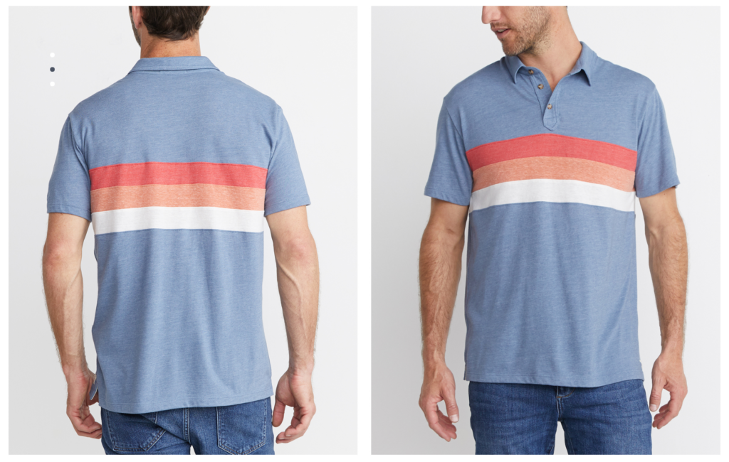
Quality images are your best brand advocates, casting the very first impression on your customers. Everything else on the page, including content and navigation, is there to build on that first impression and lead your visitors to a purchase. Customers walk into the brick and mortar store because they like what they see from the outside. Likewise, the shopper sees photos first and they have to capture their attention and ensure it matches their expectations. Photography is a key driver to your business and helps your customers better understand your products, boost your brand, and give you a competitive edge.
But they’re not completely prioritizing photos over conversion…
Tip #3: Ease the Most Common Purchasing Anxieties to Increase Conversion
The floating “add to bag” bar at the top of the page is inconspicuous enough to not distract from the experience, but still a constant reminder that you can make these your own. You don’t have to scroll all the way back up and interrupt the experience if you want to buy them. (Not to mention the nice reminder of “free shipping” and “free returns” underneath the “Add to Cart” button which seeks to ease the most common purchasing anxieties).
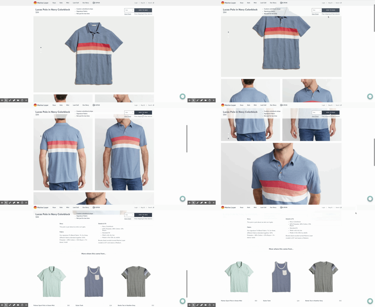
Question to Ponder: Would you rather spend $80 dollars for a polo that you know you can easily return for FREE within 30 days, or would you rather roll the dice on a $40 dollar polo with an invisible return policy?
2. Patagonia
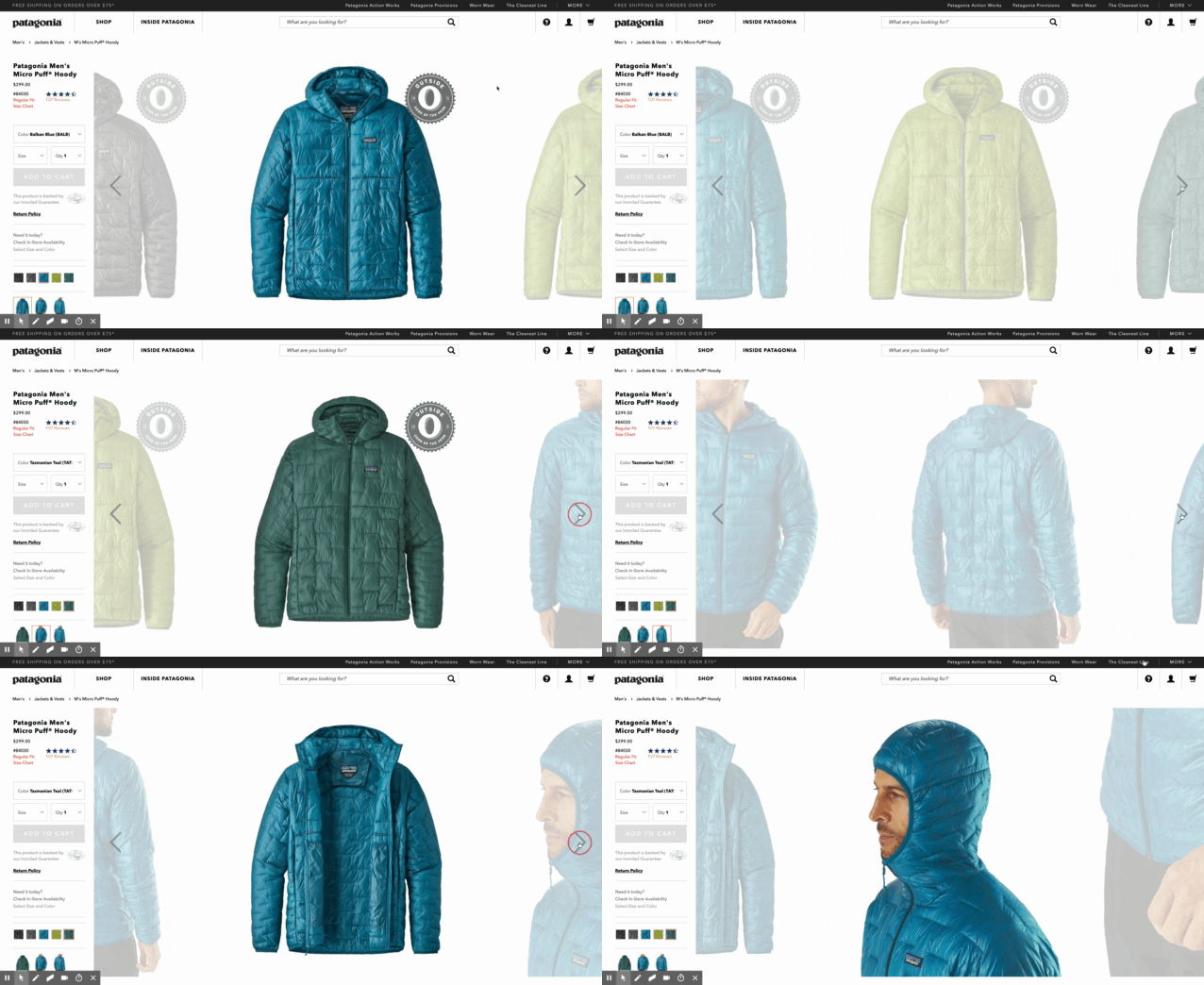
Perhaps I’m biased, having been a great fan of Patagonia’s products myself, but I particularly like this product page because it gives you a sense of what it would be like to own this product, as I can image needing this for the brutal Minnesota winters or for my next ski/snowboard adventure in the mountains (#SHECKLER).
Tip #4: Make Your Customer’s Decision Easy
The Patagonia Men’s Micro Puff Hoody jacket costs $300 dollars. The challenge Patagonia faces is that they have to convince the buyer to spend $300 dollars without them ever trying the jacket on and touching the product in-person. So what is the solution? They show shoppers what the product looks like, tells them what it feels like, and make them believe it’s something they absolutely need to own.
For example Patagonia provides photos and videos of the different colors of the jacket, what the jacket looks like from every angle – with the hood worn, as well as when the jacket is compressed into a bag.
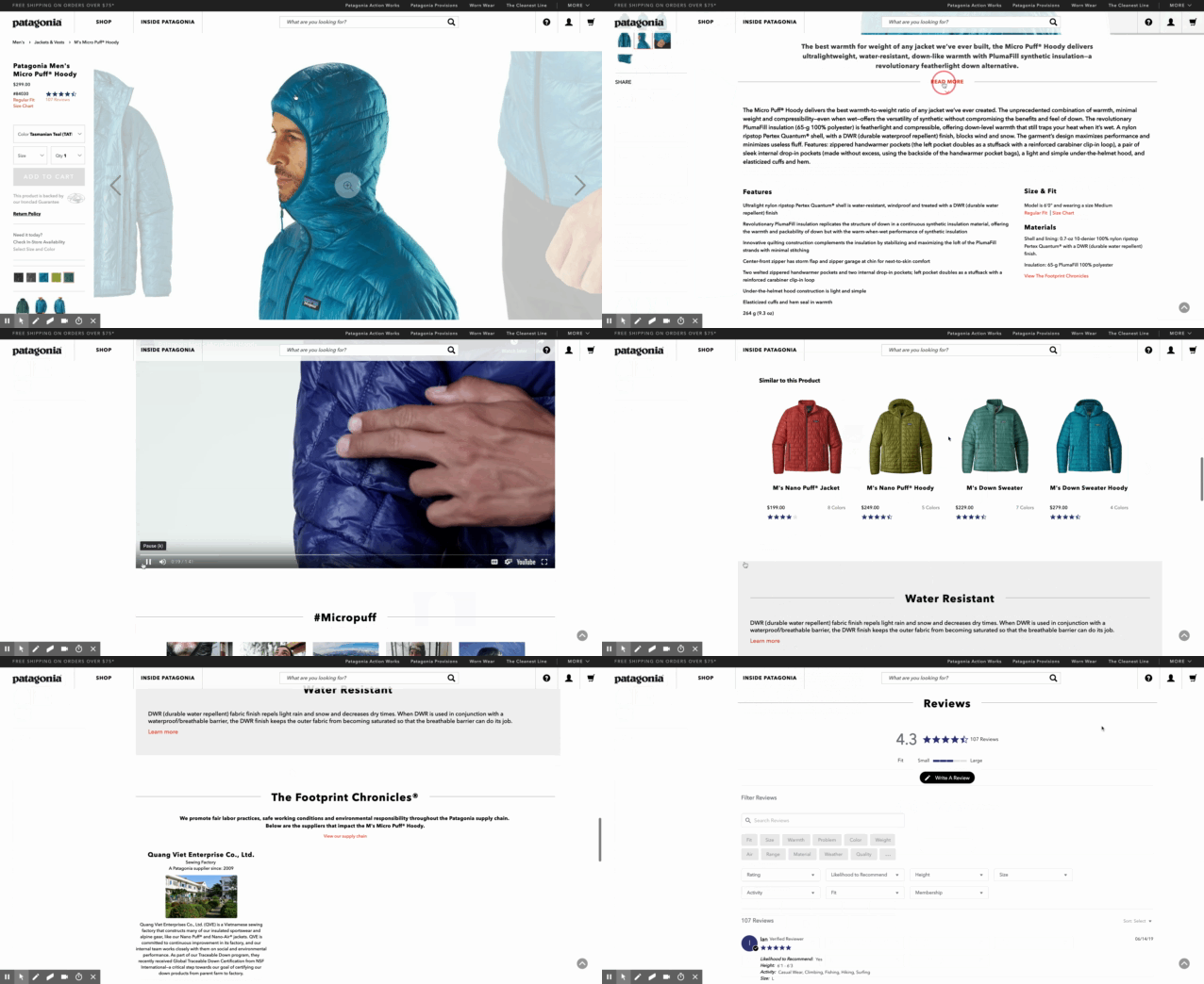
Further, scroll down and a more robust product discovery experience awaits. Graphics that highlight the features, benefits, and materials of the product, along with user-generated content in the form of videos, give you a deeper dive. For example, the jacket is highly water resistant and has more more warmth for its weight than any jacket Patagonia has ever made.
Tip #5: Use Social Proofs To Drive Brand Credibility and Trust
Beyond the flashy effects of their site, the design is elegant and clean as well. The page layout gives a brief nod to some of the standard “why buys”—, lifetime warranty, free shipping, 5-star product reviews, and even displaying customer testimonials from instagram wearing the product. Well played.
Question to Ponder: Would you buy a $300 dollar jacket online if this amount of information wasn’t provided?
3. Vineyard Vines
Tip #6: Keep Variations in Mind for Cohesive Branding
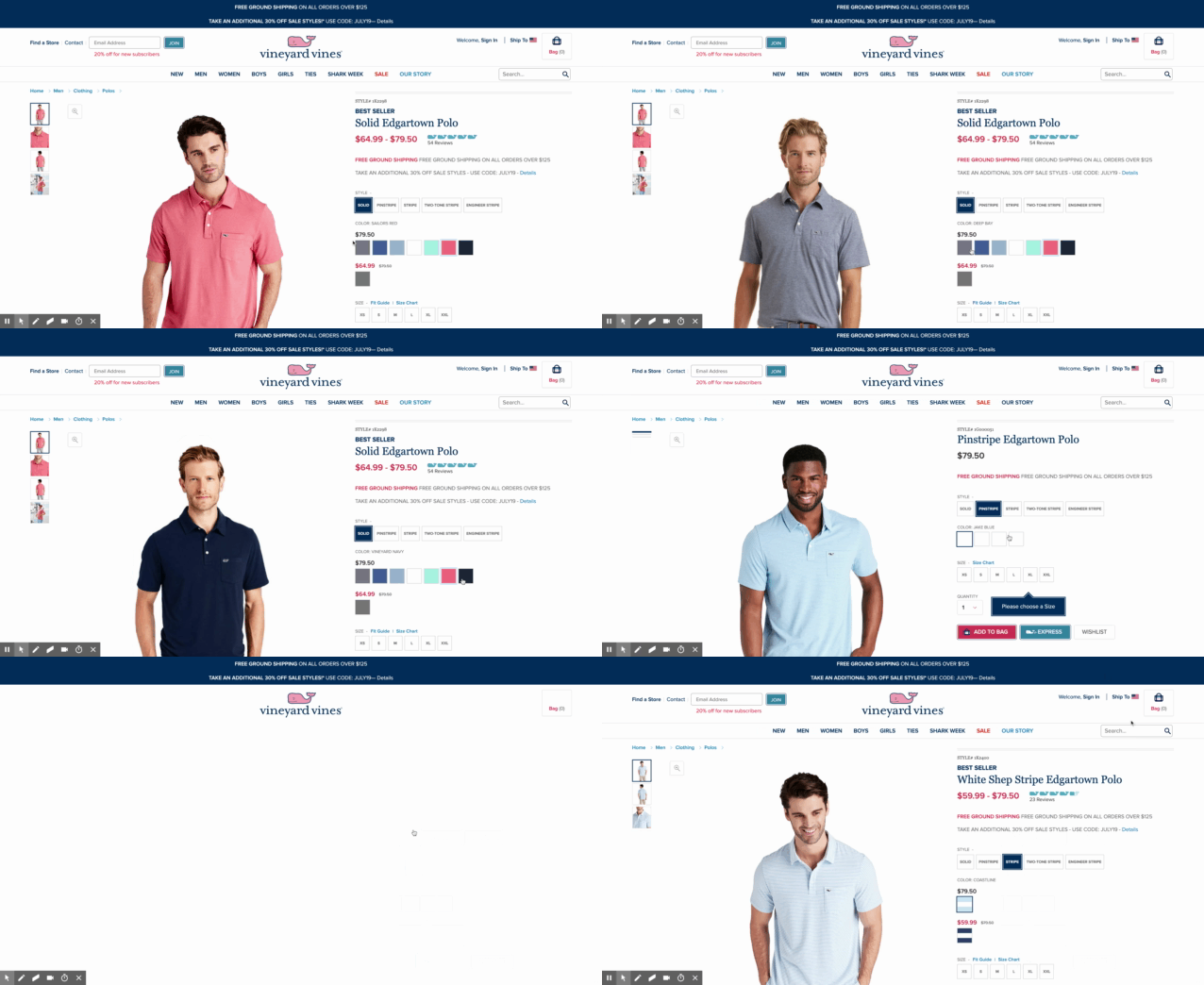
Think about your products as a ‘family’ that needs to be presented as a group.
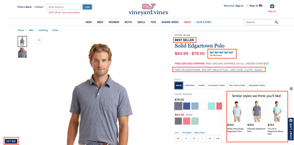
For example, notice how customers can choose different products in the group (Polo Styles), display color variants, & view the product thumbnails all from one page.
This results in an improved user experience as well as reduces the number of steps to conversion.
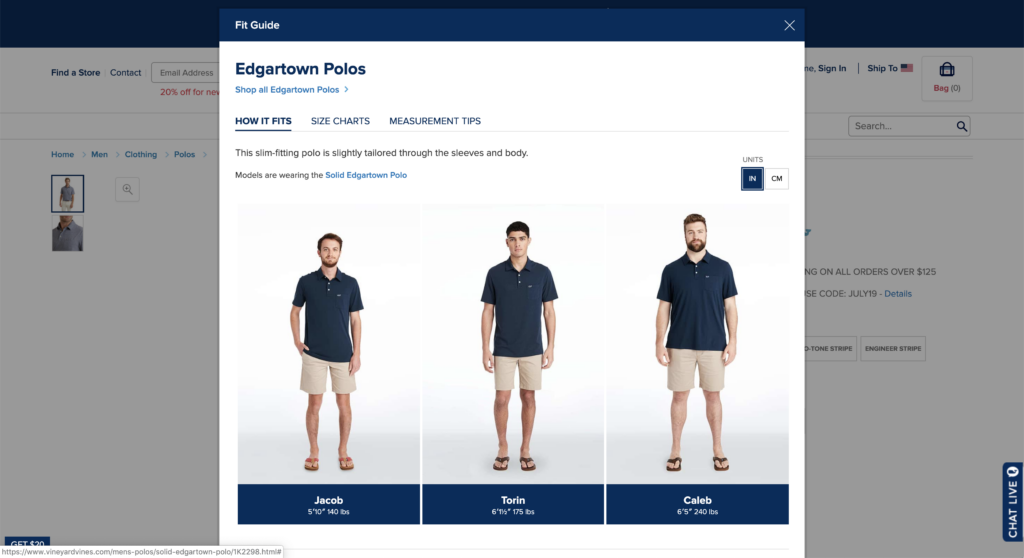
Tip #7: Size Charts/Fit Guide to Increase Confidence To Conversion
My biggest concern about buying clothes online? Is not what brand it is, or what the material feels like, but not knowing how will it fit on me.
Will it be too tight and I look like I am a try hard, or will it be too big and I will look fat?
Thus, size charts & fit guides are effective to increase clarity regarding size, so more visitors can move forward with confidence to complete the purchase.
Pro Tip: Add a size chart popup to your product page to reduce product page bounce rate
Tip #8: Create an Amazing Customer Experience
Your customers do not want to guess what products are your newest arrivals, best sellers, or on-sale. Add product badges/tags so your customers can visible notice what products are best sellers, newest arrivals or on sale.
Vineyard Vines even include 20% off for new subscribers.
Tip #9: Product Recommendations on your product page
Occasionally, customers are so focused on buying one of your products that they neglect to browse around to find more. This leads to smaller carts, and as a result, smaller average order values. To address this problem, try adding product recommendations to your product pages. Vineyard Vines lists recommended/similar products that other customers purchased in addition to what’s currently in the user’s cart, which minimize steps to conversion before checkout and increases average order value.
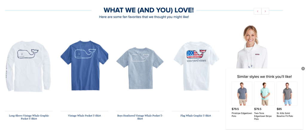
To illustrate this point, here’s Vineyard Vines sharing which products other users viewed as well as a static bottom right popup with “Similar styles we think you’ll like”. This is a great technique to get users interested in other products.
4. Mack Weldon
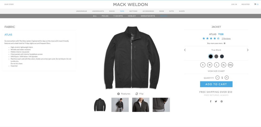
Mack Weldon is another brand that focuses on clean products, with a matching clean design for their product pages: White backgrounds, grays, and subtle hints of muted color draw the eye to the product images.
Tip #10: Show Why Your Product is Better
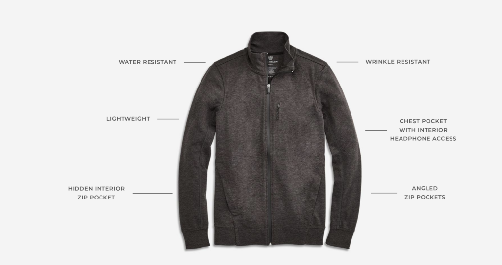
Mack Weldon includes great product photography and interactive features that highlights the features, benefits, and materials of the product.
For example, see below:
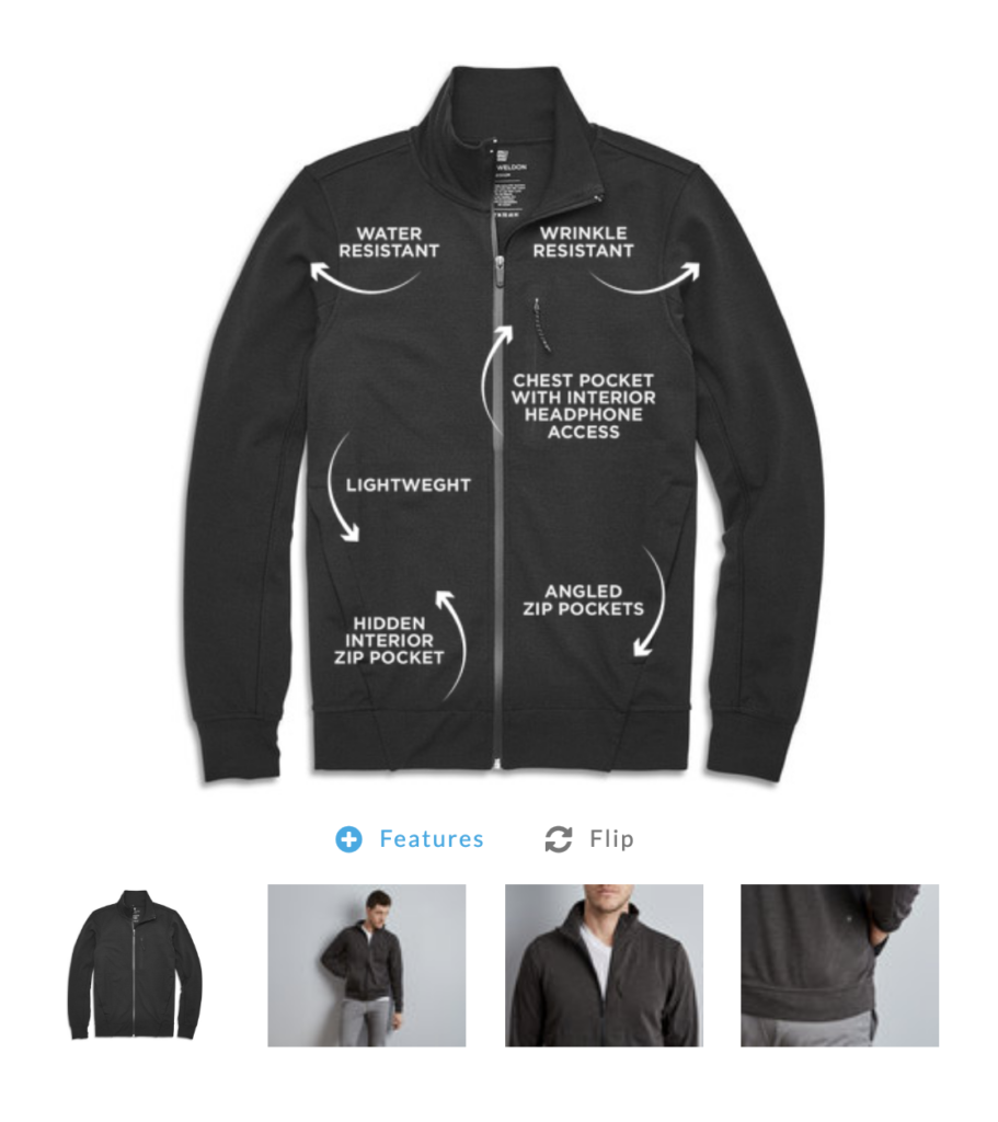
As you scroll down the page, you discover more about the detail-oriented design of the Jacket—what they were made of, which advanced features they have, and what size is best for you.
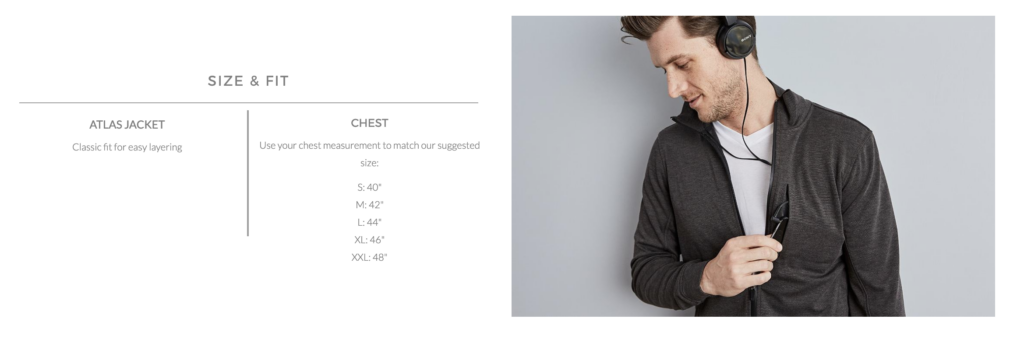
What’s more, a lot of these are interactive — the section under “Every Detail Matters” allows users to click on the different features to see how they appear on the product.
Tip #11: Increase Average Order Value With Free Shipping Threshold
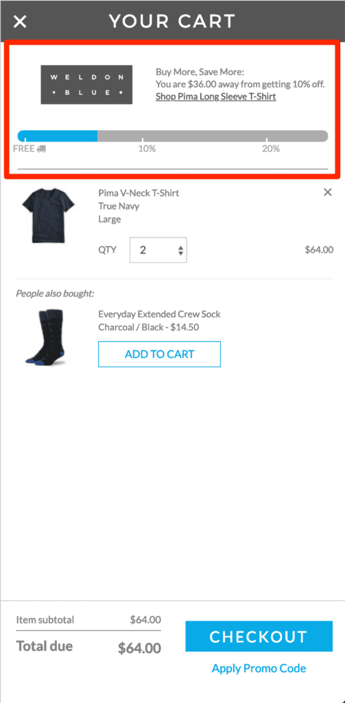
One of the most popular ways to increase average order value is to offer a free shipping threshold, as virtually all e-commerce websites have some sort of minimum order amount to get free shipping. For example, notice how their progress bar combines a free shipping threshold with additional discounts based on the cart size. This is a perfect way to boost AOV.
Additionally, when you click the “BUY NOW” button, the shopping cart pops up on the right-hand side of your screen to remind you that you can check out at any time. It’s a not-so-subtle reminder that you have yet to close the deal, and it clearly identifies the ways that you can pay. This effectively turns the product page into the checkout page, which is a powerful way to speed along the purchasing process.
Tip #12: Up-sell or Cross-Sell Complementary Products With a Slide-In Cart
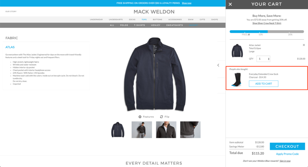
Much like the previous strategy, this tip includes adding product suggestions in your checkout flow. In this case, instead of simply suggesting other popular items from your store, hand-pick products that pair well with the item in the user’s cart, such as accessories or add-ons.
For example, Mack Weldon has built a customized Slide-In Cart that makes purchasing as easy as possible by:
- Giving the option to update cart items + quantity
- Offering different product up-sells
- Ability to apply coupon code
- Applying free shipping automatically as well
5. Bombas
This one doesn’t take much explaining. It’s immediately obvious why this is an attention-capturing product page.
Tip #13: Attention-Capturing & Memorable User Experience
The Bombas brand is fun and playful, much like its product pages.
For example, the experience of clicking through the color variations and product thumbnails not only encourages shoppers to check out the different options, but brings the website and its featured photos to life in a highly novel way, unlike any other ecommerce product pages I have ever seen.
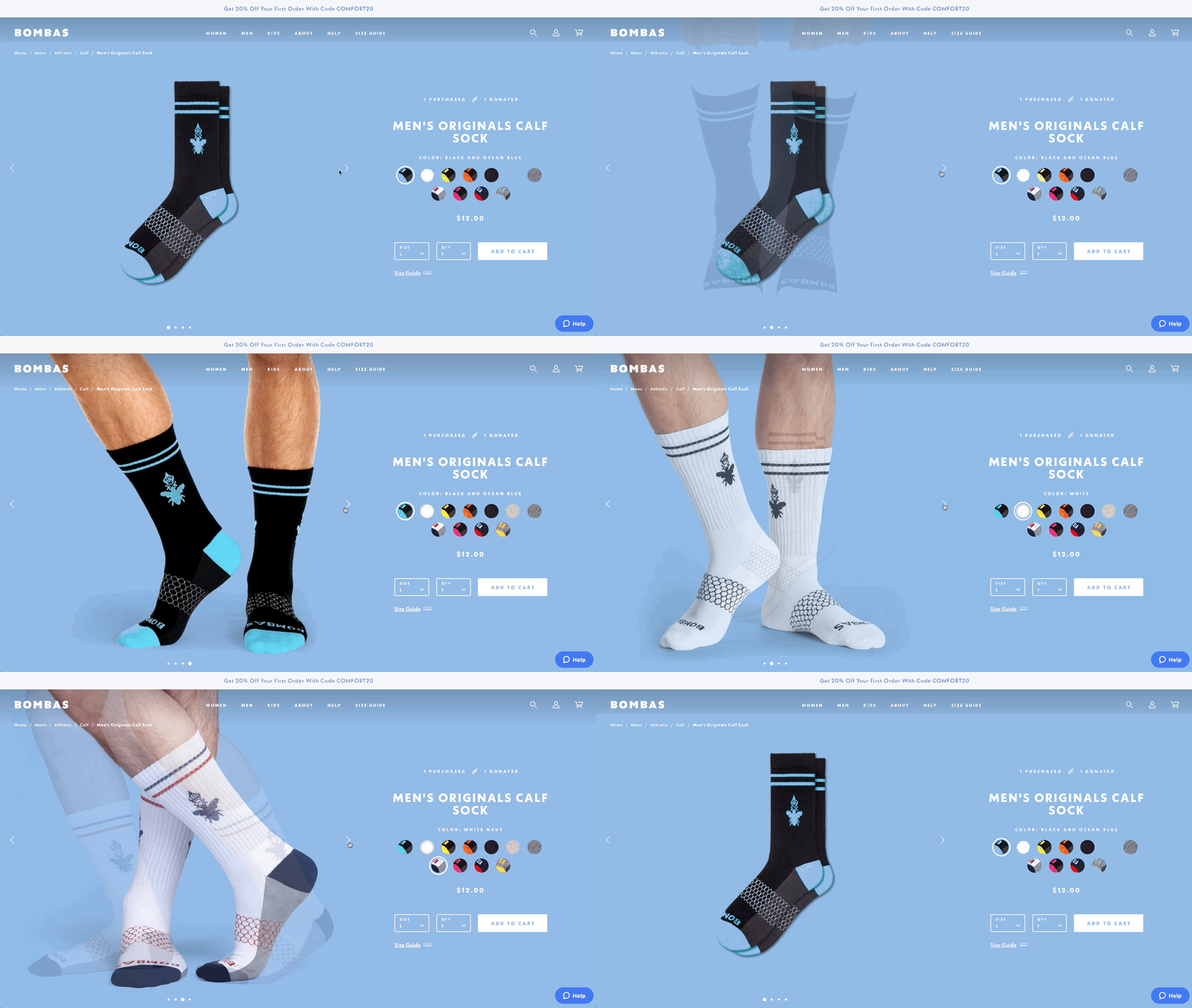
Tip 14: Simple Design for a Simple Product
A simple design with splashes of color draw your eyes to a few key elements on the page: the product photos, the color variants, and most importantly, the “Add to Cart” button.
This uncluttered design removes any distraction from the buying experience, and results in giving users a clear and direct path to purchase.
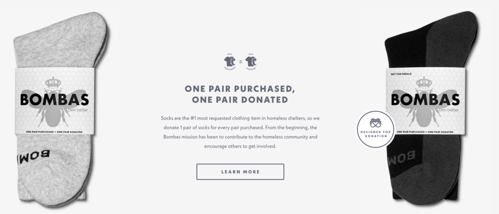
Tip #15: Use Social Good to Influence Price (One Pair Purchased, One Pair Donated)
They also take this opportunity to share their mission to contribute to the homeless community and encourage others to get involved, even though they may be charge more than their peers.
Notice how they reiterate that your purchase helps them get closer to achieving this goal: “One Pair of Socks Purchased, One Pair of Socks Donated.” Who wouldn’t want to contribute to the homeless community and get a great pair of socks out of it?
6. Birddogs
The entire Birddogs brand and it’s products are juvenile, funny, and simple, much like its product pages.
“Best Men’s Gym Shorts for hitting the gym or the couch”
“For the free balling crotch crusaders”
“They hold everything in the right place”
Tip #16: Gallery of Product Photos
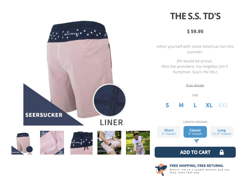
If your feature image successfully wins over your visitors, the next thing they are most likely to do is browse your image gallery.
Galleries are another important aspect of ecommerce product page design. Ideally, you will have about a 3-4 images in such a gallery, most of them clean-cut, like your feature image, and showing your product from all relevant angles.
It’s also good to include at least one or two in-context or lifestyle images to invite an emotional response from your customers. For example, Birddogs lifestyle images include a closeup shot of a man’s crotch, as well as a man dropping soup.
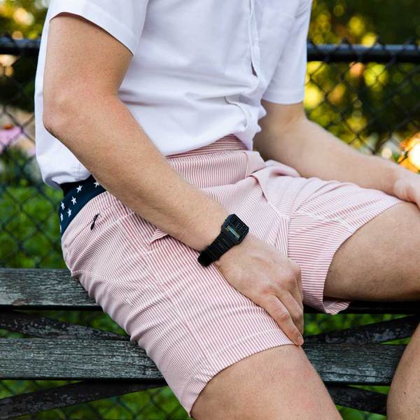

Like I said the brand is funny, simple, and…. JUVENILE
Did I Miss Anything?
Now I’d like to hear from you:
Which strategy from today’s post are you going to try first?
Or maybe I didn’t mention one of your favorite Apparel product pages?
Either way, I would love to hear your thoughts in the comment section below!
P.S. Don’t blame me if you find yourself wanting to purchase one or more of these products. That is, after all, the very purpose of an effective product page 🙂
